06Logos and visual systems
Brandidentities
Marks and systems for academies, clinics, beauty and craft.
Identity work for businesses across education, health, beauty and retail, from the first sketch of a mark to the system that carries it onto signage, print and screens.
- 01 / 11Marketing
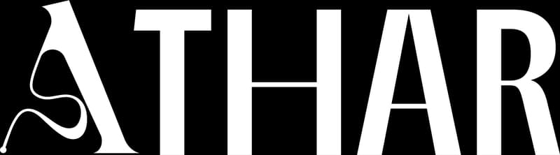
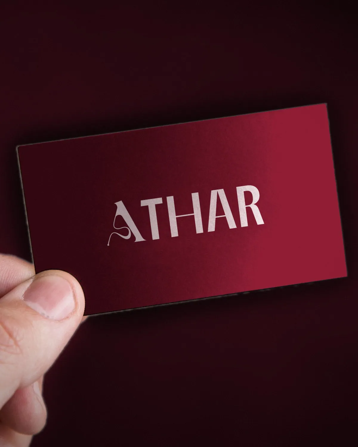
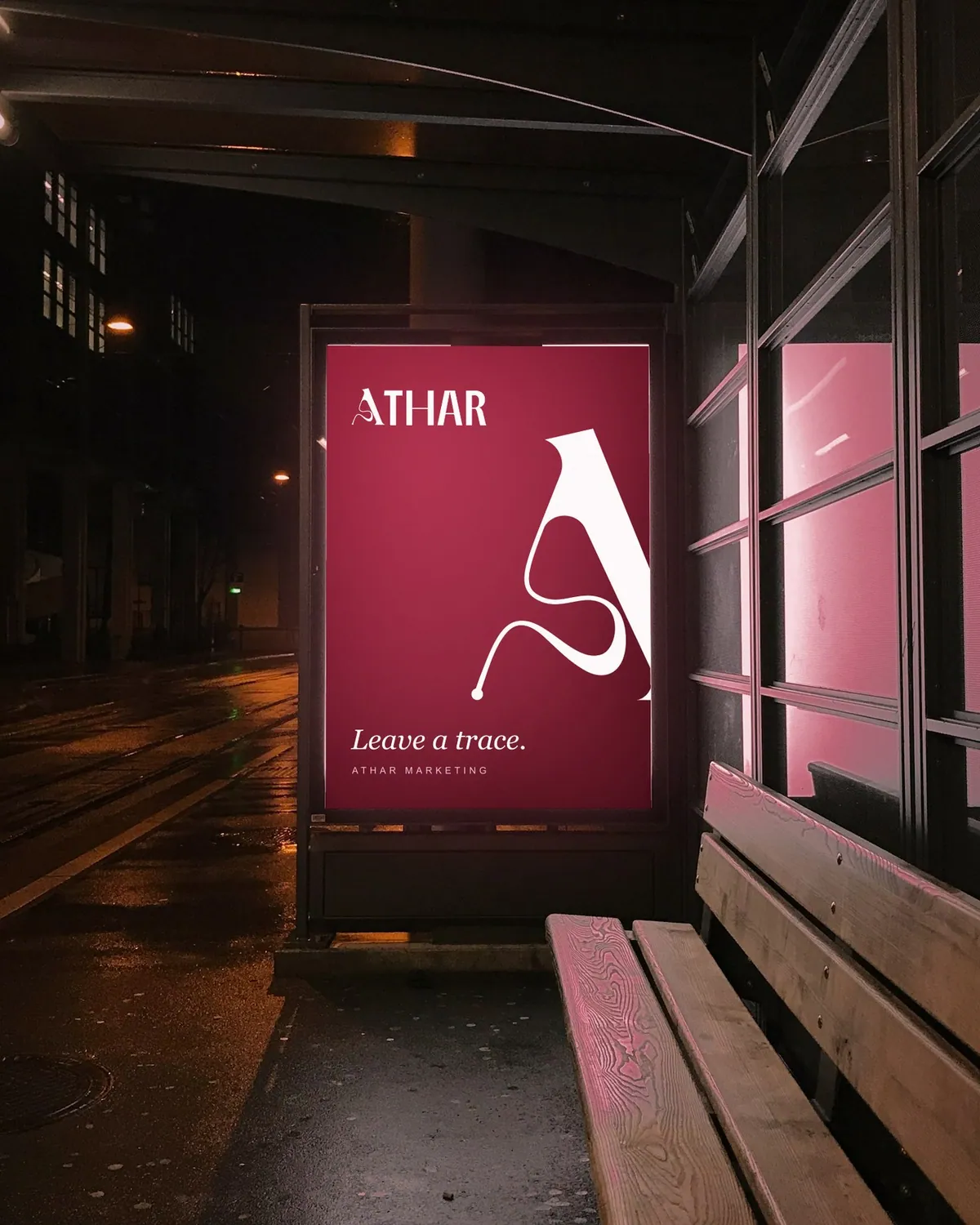
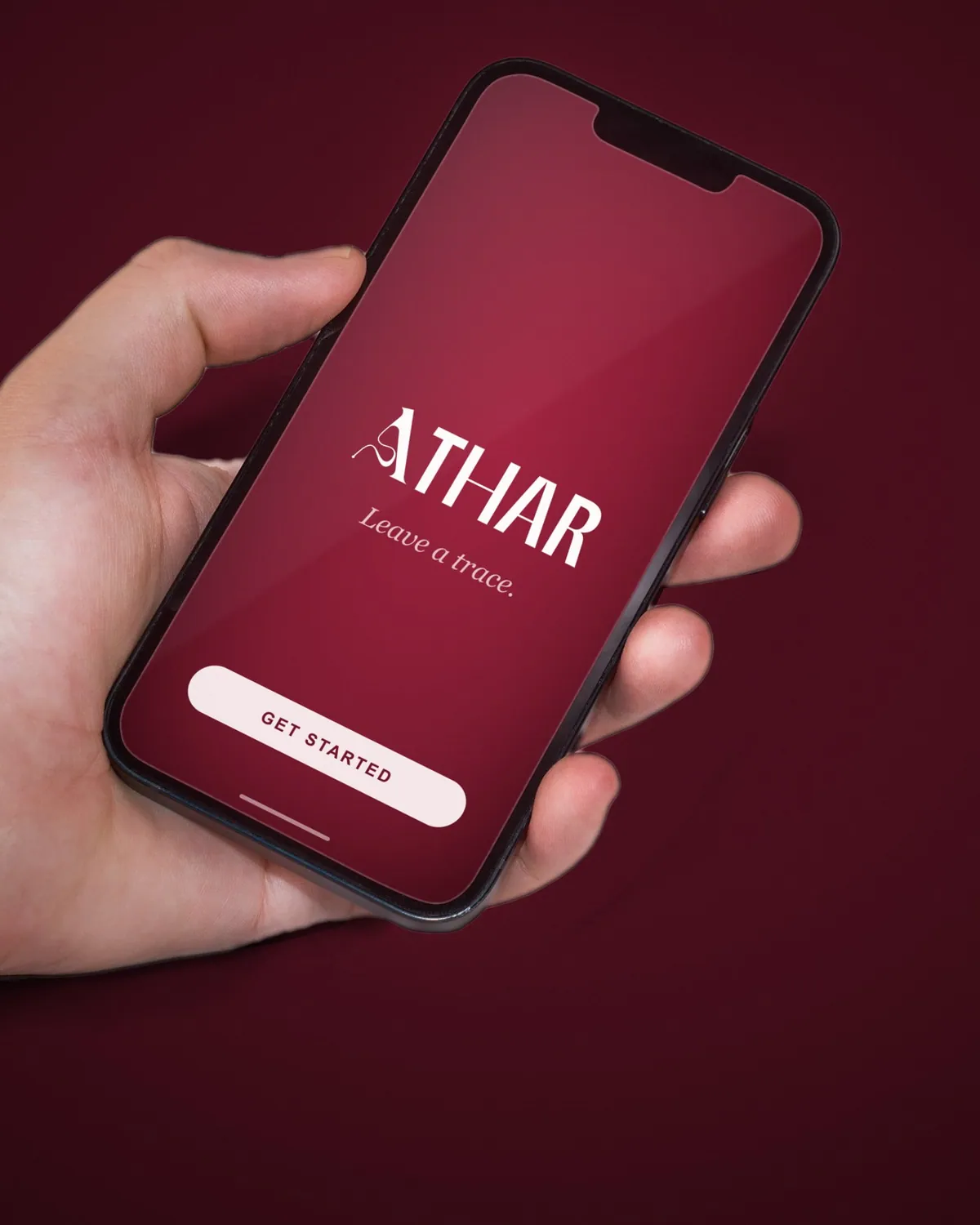
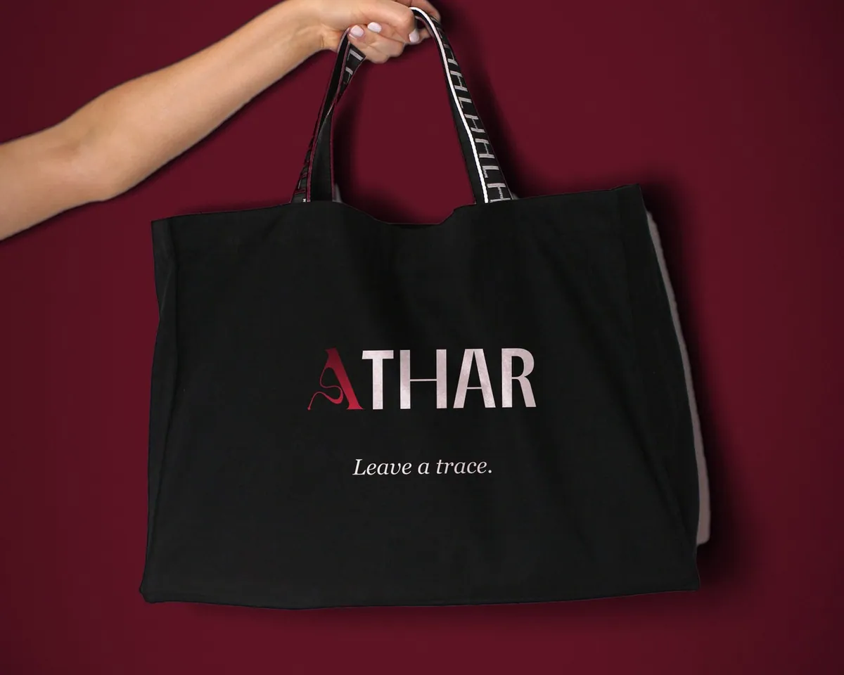
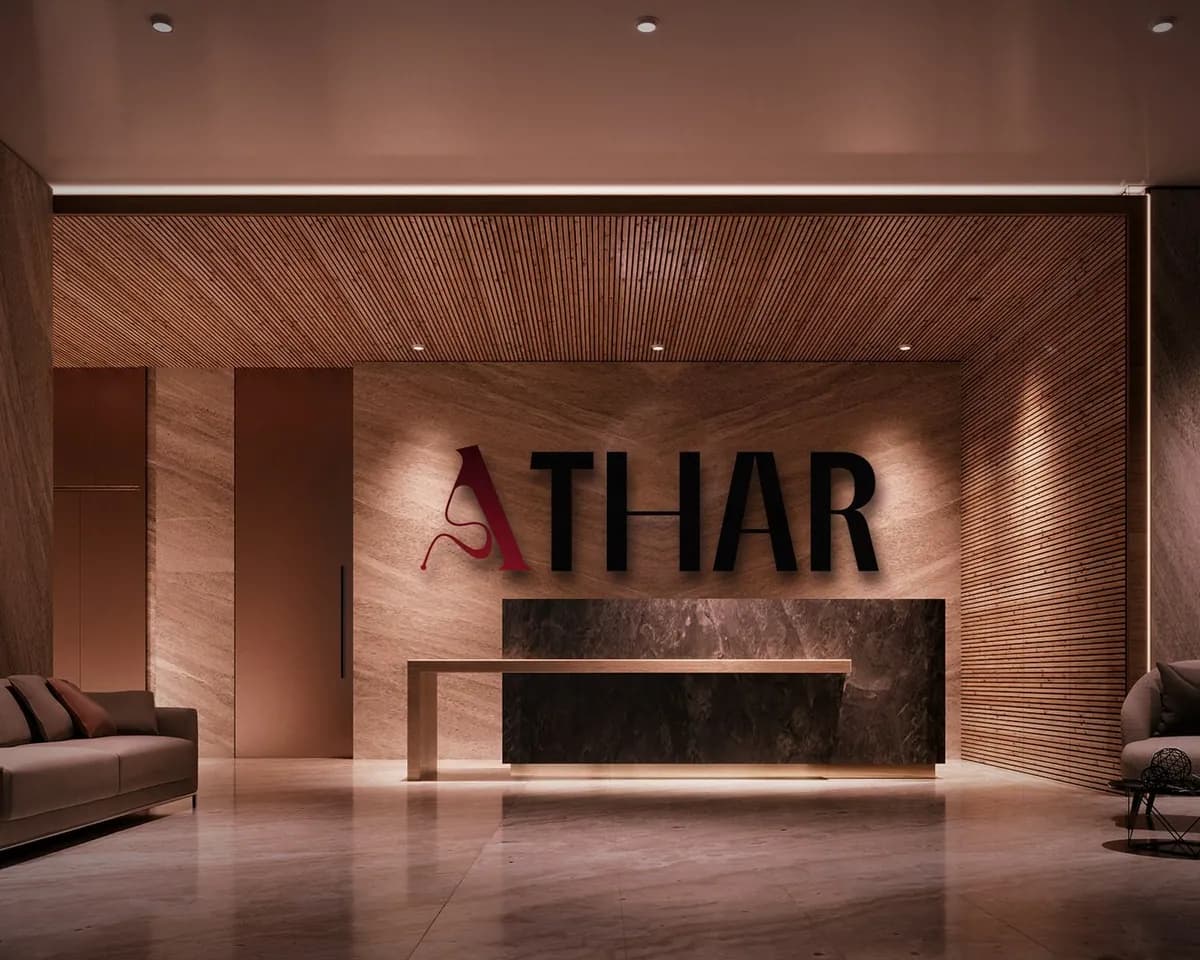
A digital marketing company named for the trace a brand leaves behind. The A trails a single ribbon of ink, set beside a tall, quiet wordmark in crimson and black.
- Crimson #A42039
- Oxblood #5C0F1F
- Ink #111111
Antonio, matched to the wordmark
- 02 / 11Dental care
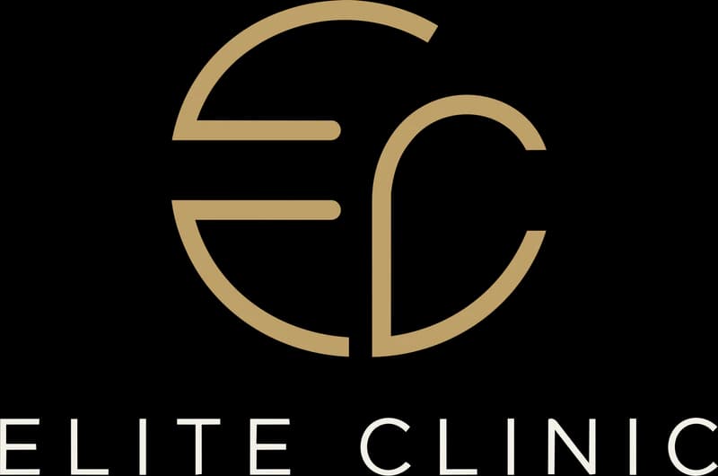
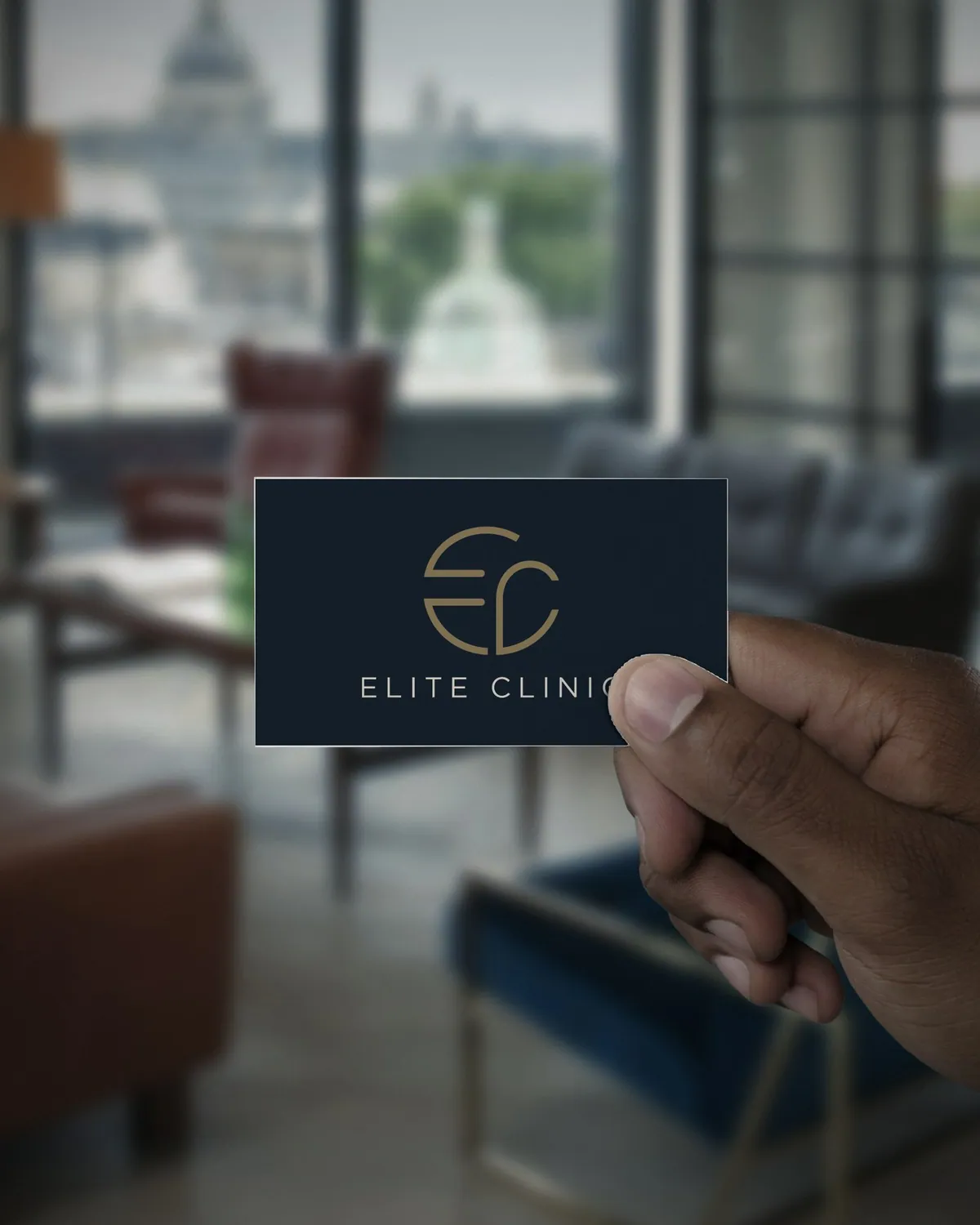
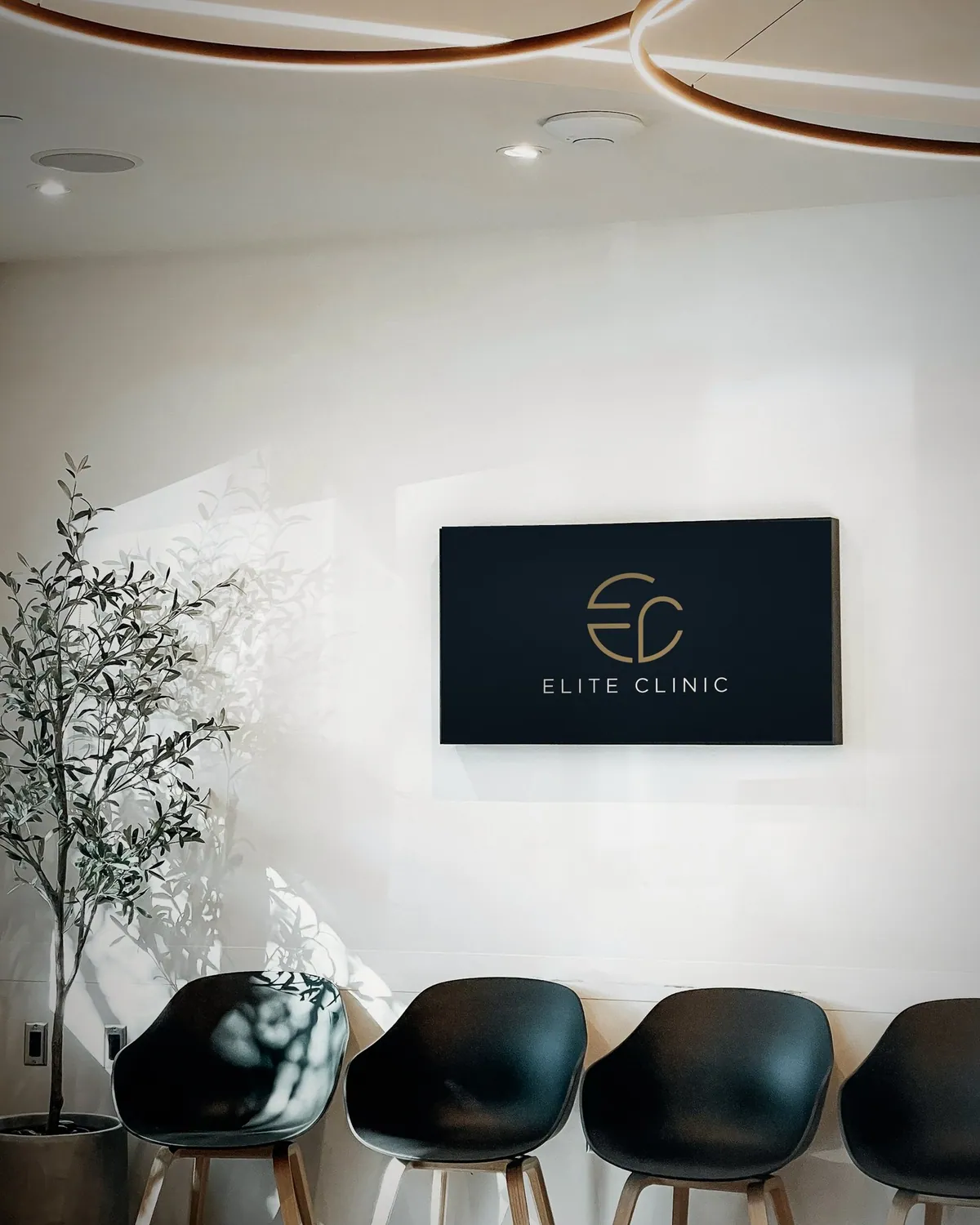
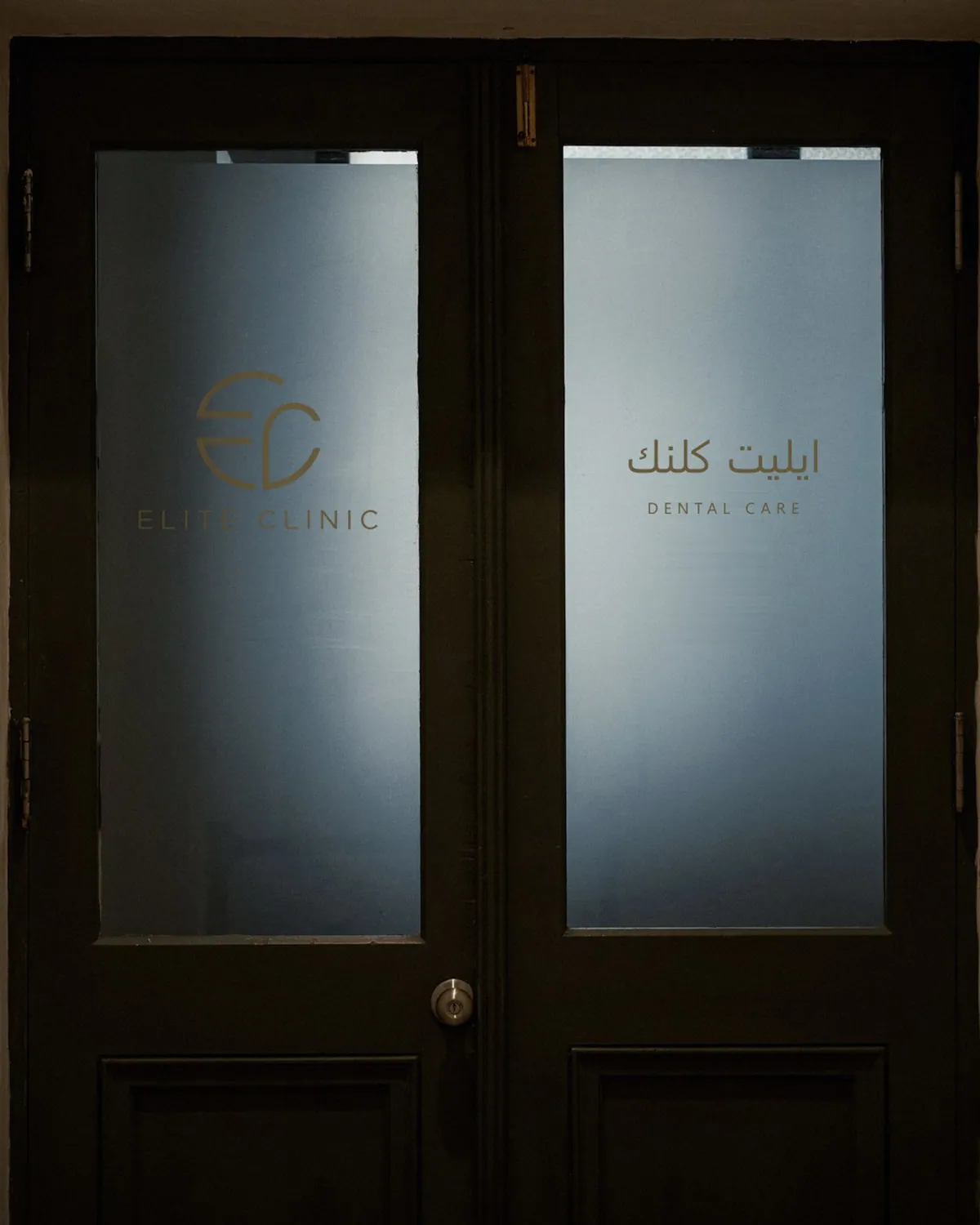
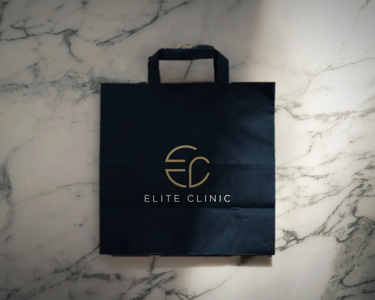
A dental clinic for preventive, restorative and cosmetic care. The E and C are drawn from one circle, in champagne on deep navy, with Marcellus and Jost for a calm, premium voice.
- Deep navy #18242F
- Champagne #BFA06A
- Warm white #F4F0E8
- Ivory #E9E0D0
- Greige #B0A38E
- Soft teal #4E817B
Marcellus for display, Jost for text
- 03 / 11Leather goods
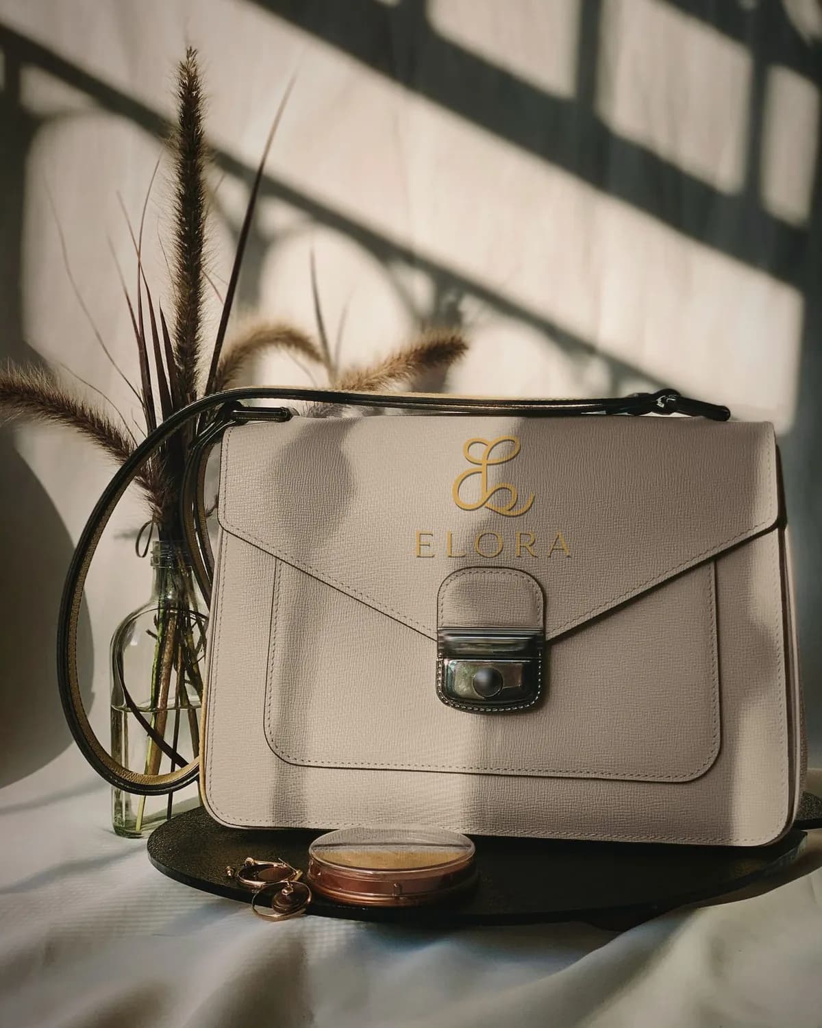
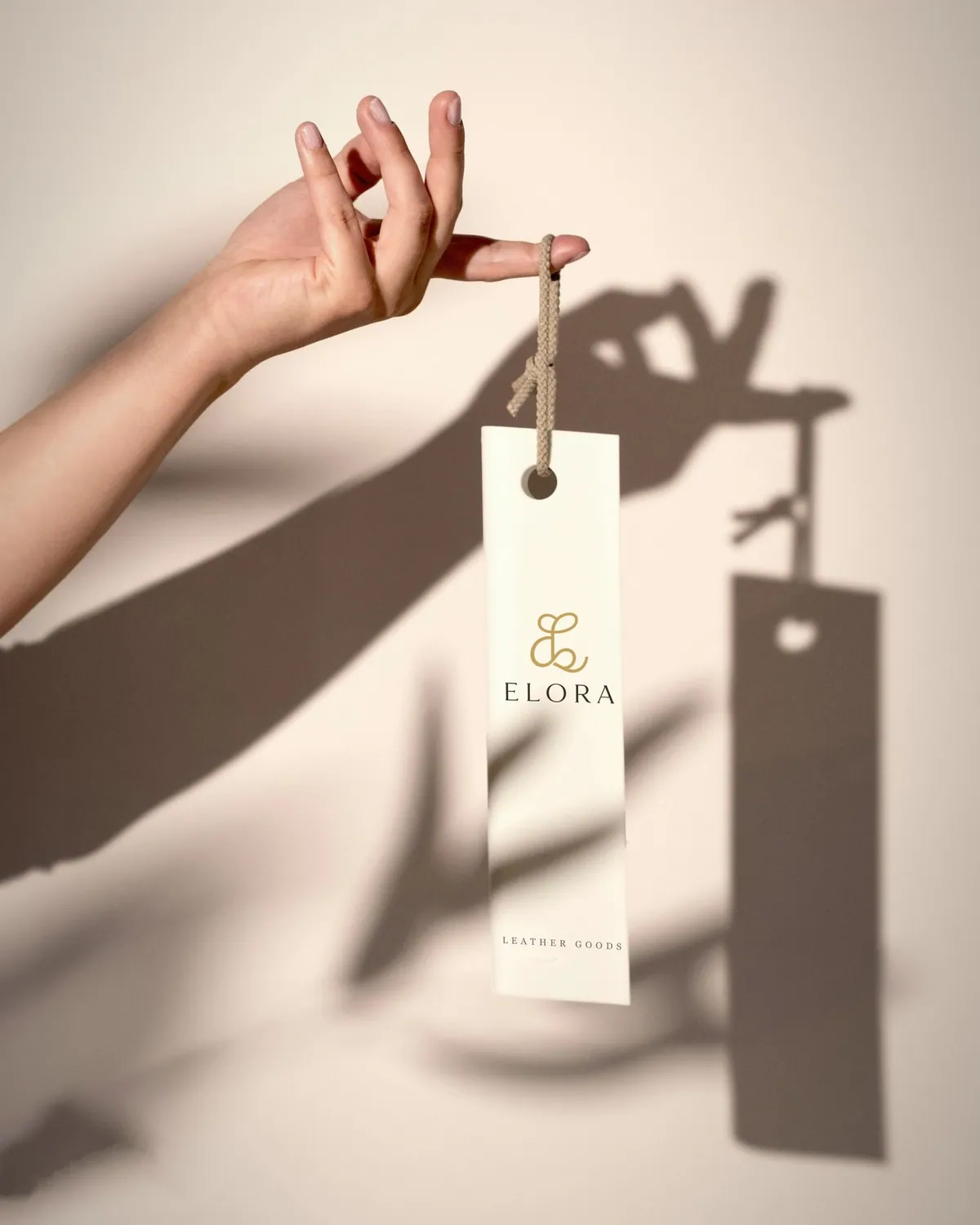
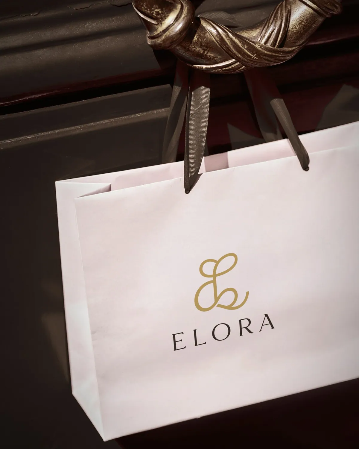
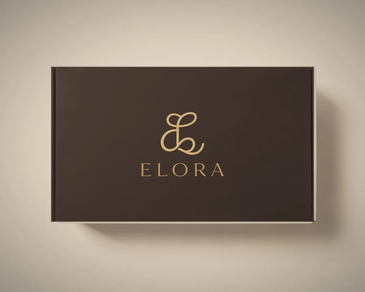
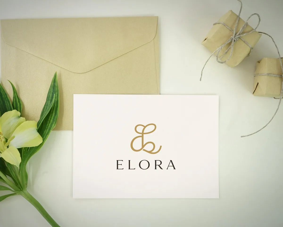
A label for bags and accessories. An E and L looped into one continuous line, finished in gold over a widely spaced serif, made to sit quietly on leather, a swing tag or a card.
- Ivory #F7F3EE
- Cream #EDE5D8
- Beige #D9C8B4
- Taupe #A89A8A
- Mocha #3A2E28
- Gold #C8A86B
Cormorant Garamond, matched to the wordmark
- 04 / 11Beauty
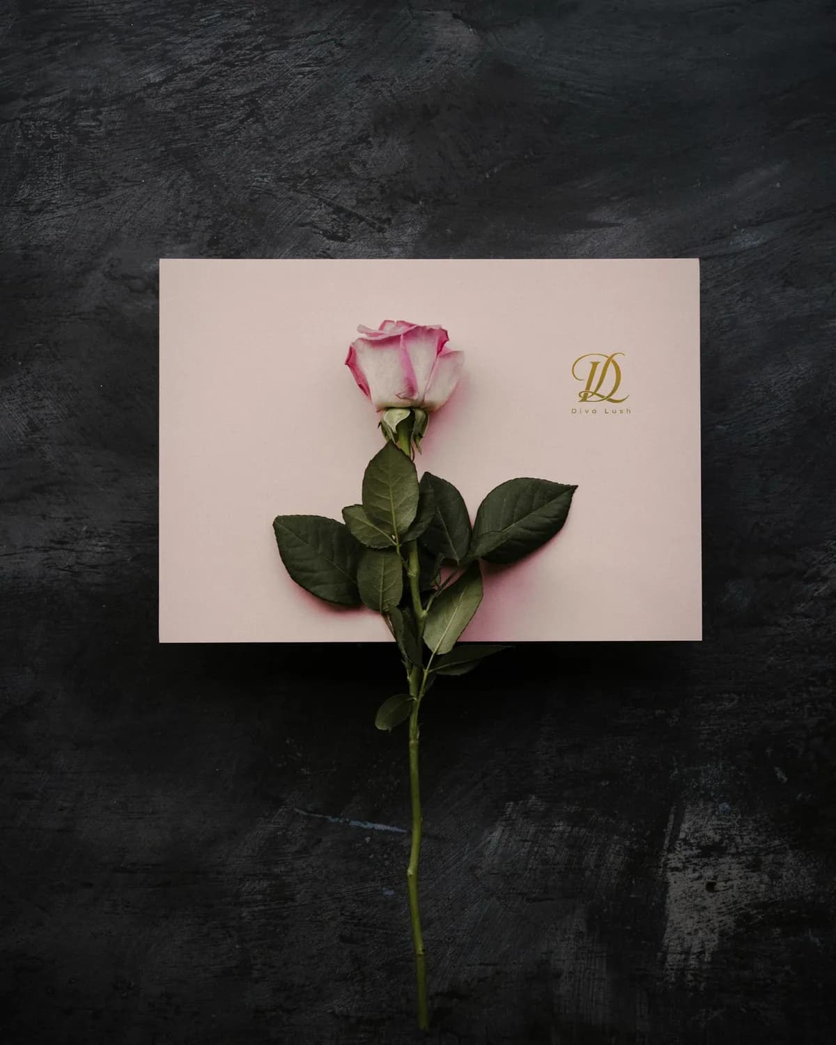
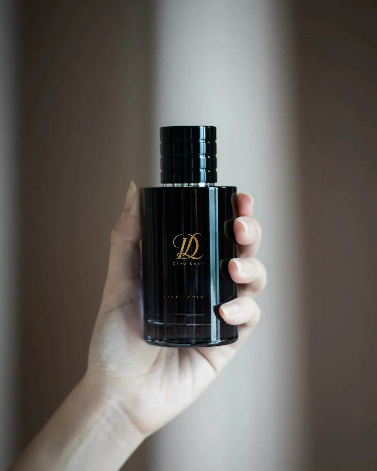
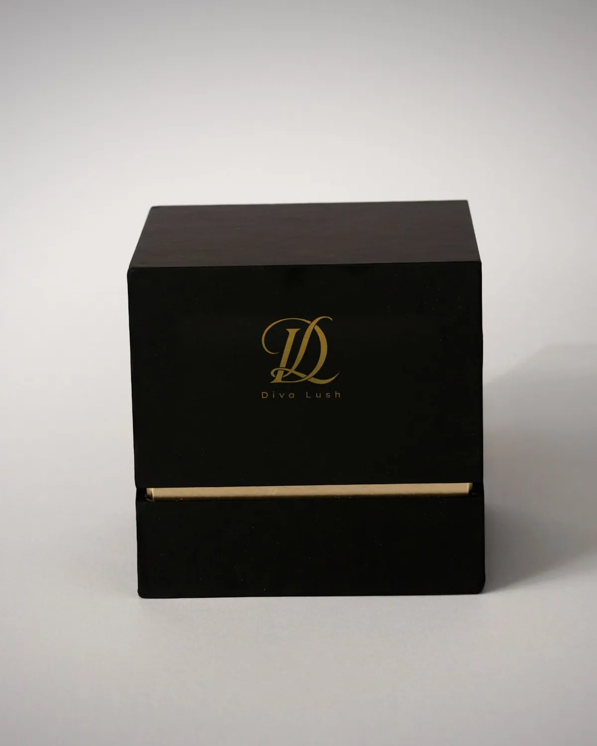
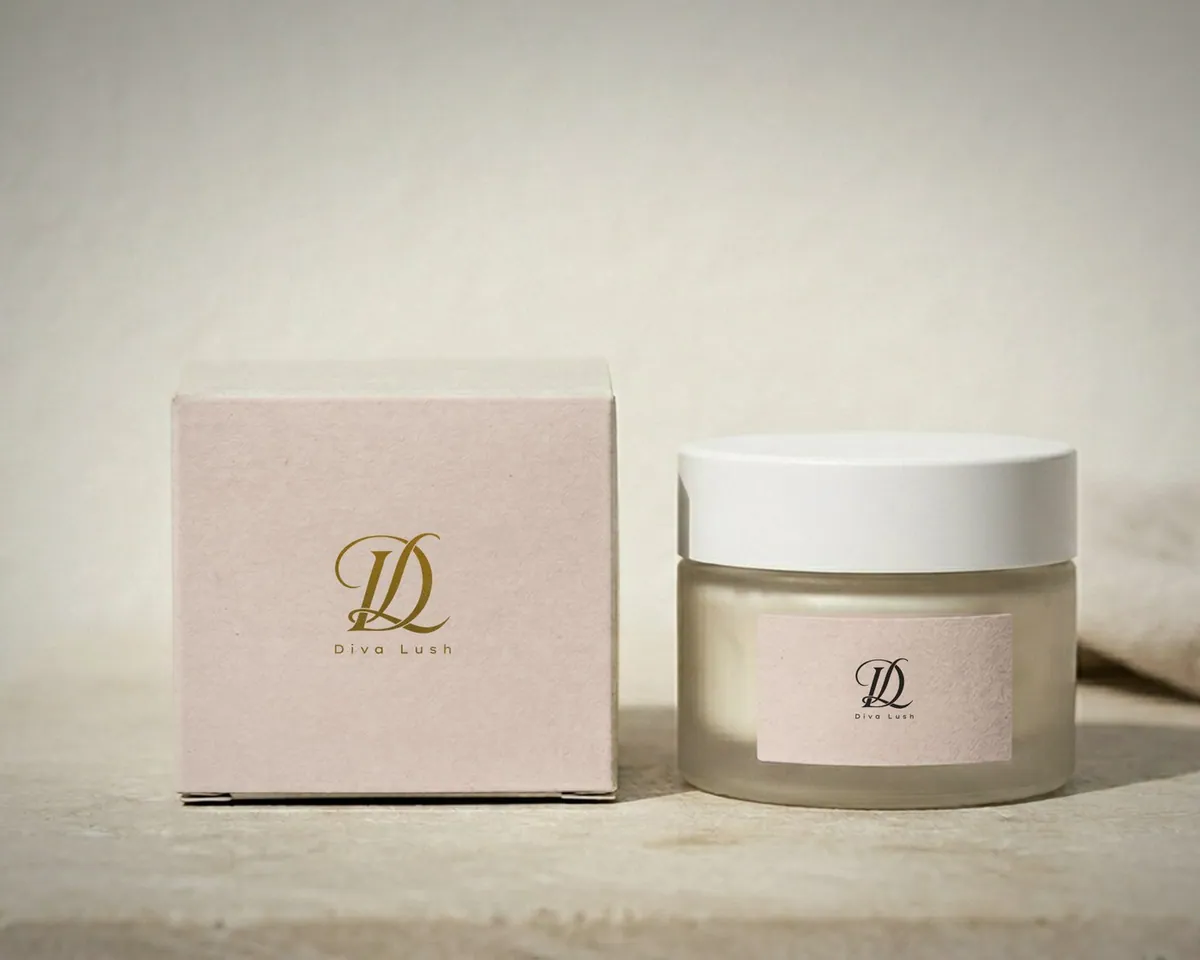
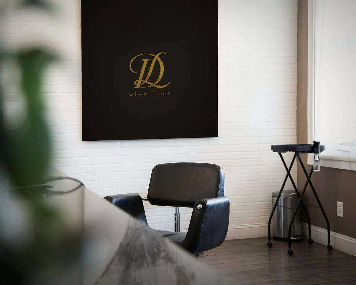
A beauty brand. A calligraphic D and L crossed into one monogram, made for gold foil on black stock, with a light, widely tracked name beneath it.
- Gold foil #C9A243
- Blush #D9C9BF
- Velvet black #141210
Montserrat Alternates, matched to the wordmark
- 05 / 11Education
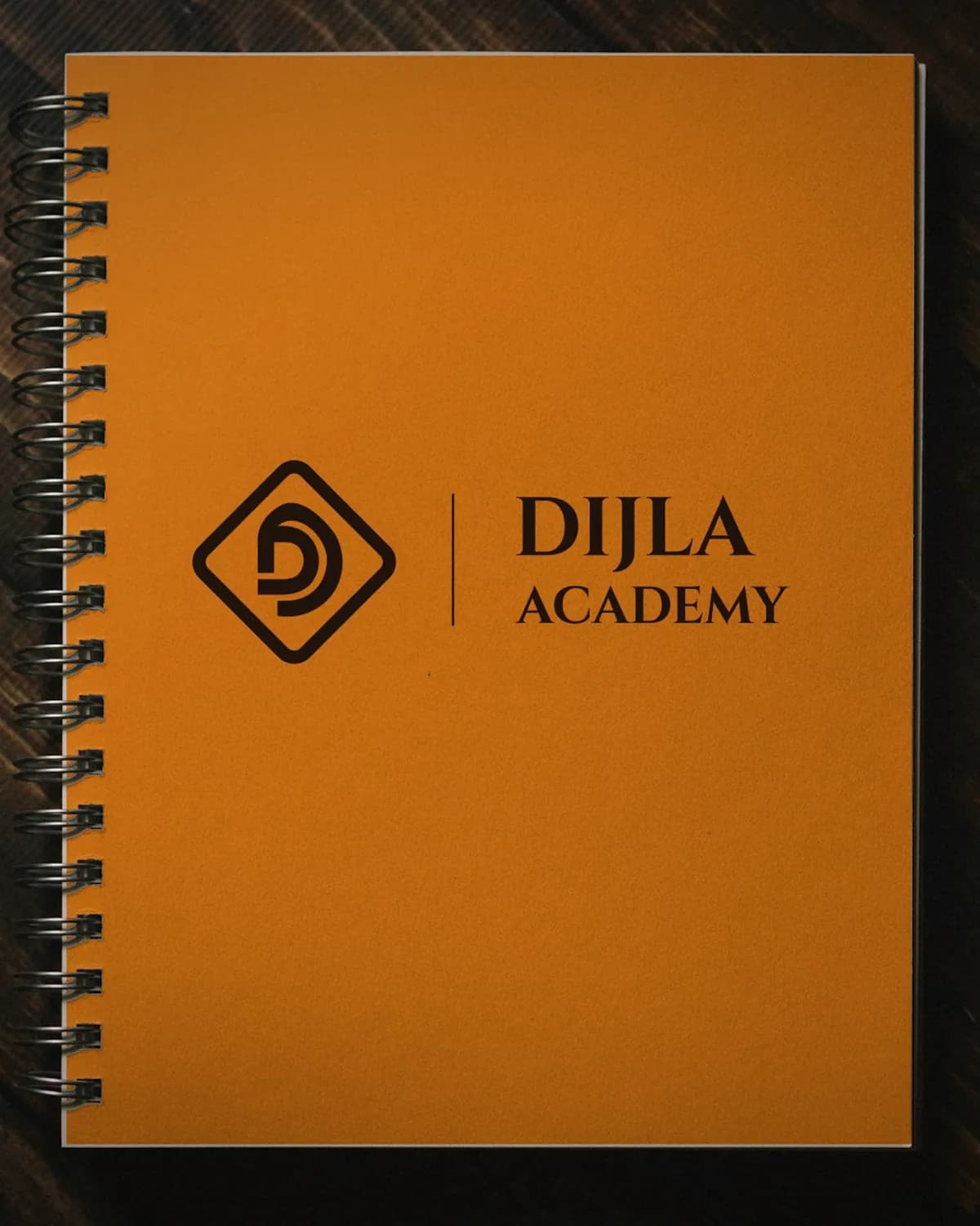
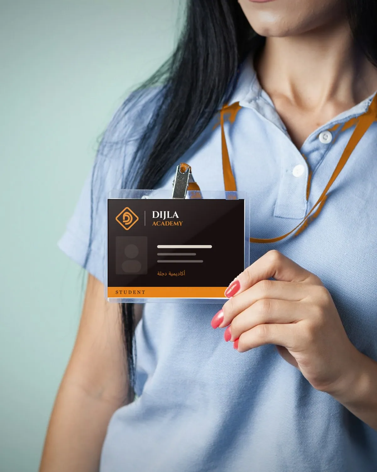
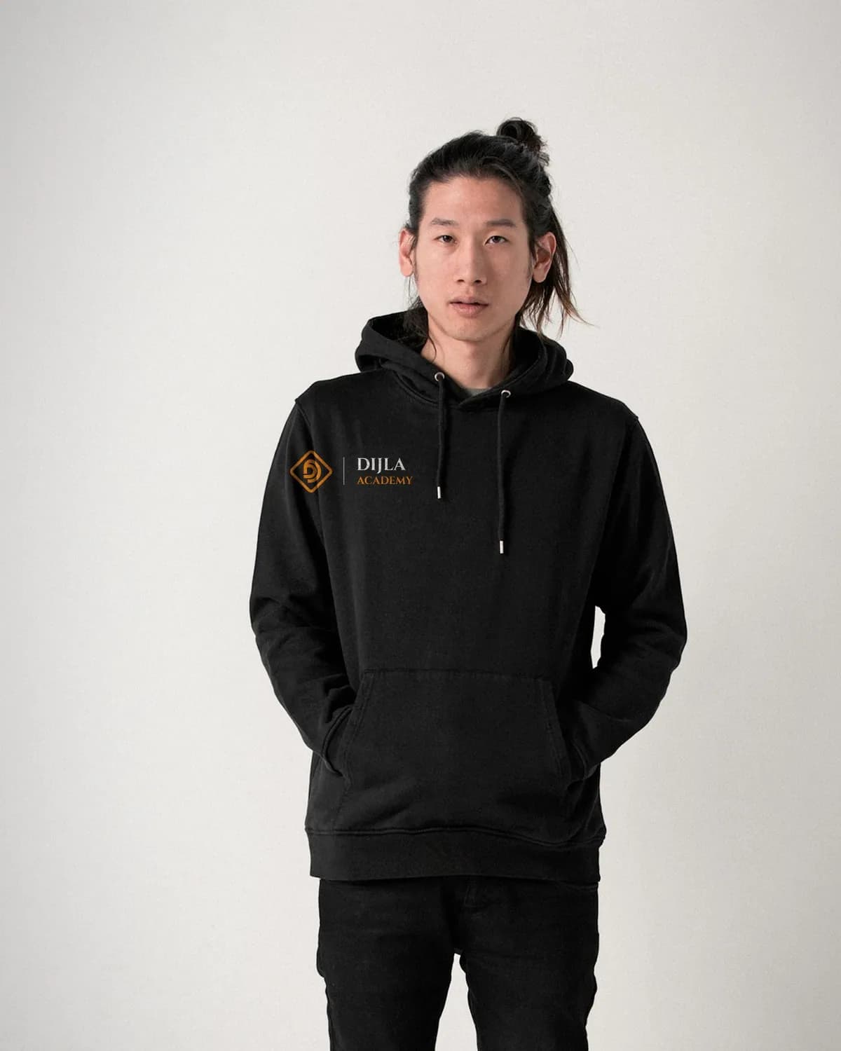
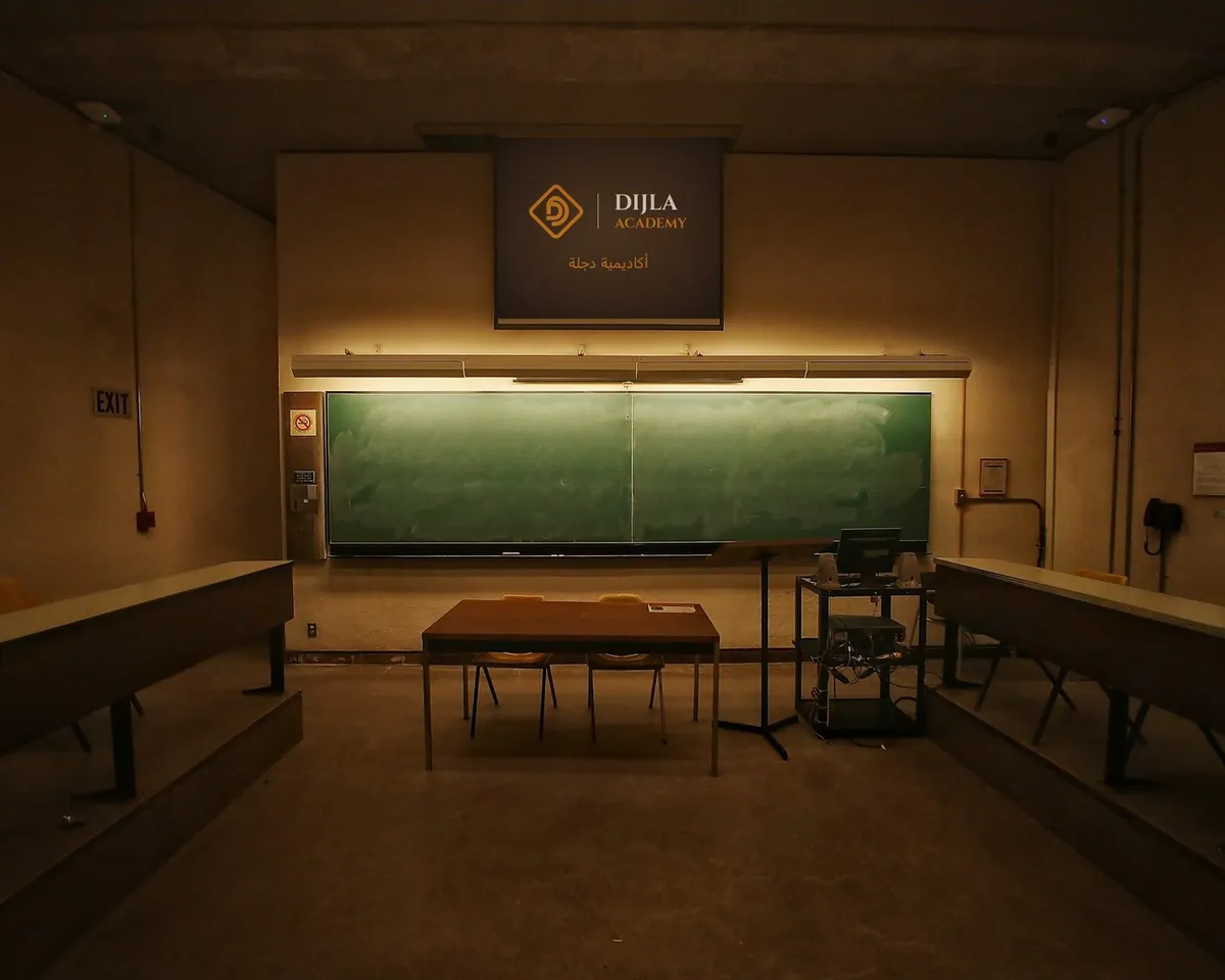
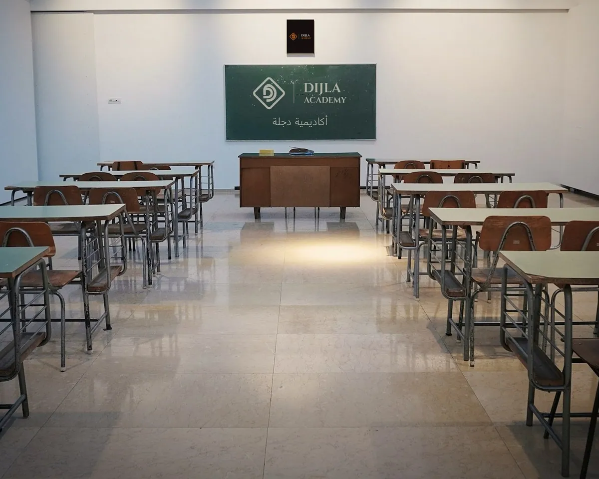
An academy named for the Tigris, Dijla in Arabic. The D sits inside a turned square that reads like a seal, in academy orange on near-black, with classical capitals for the name.
- Academy orange #EB8517
- Ink #181010
- Paper #F5F1EA
Cinzel, matched to the wordmark
- 06 / 11Industry
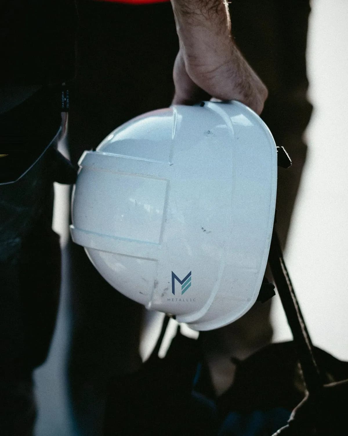
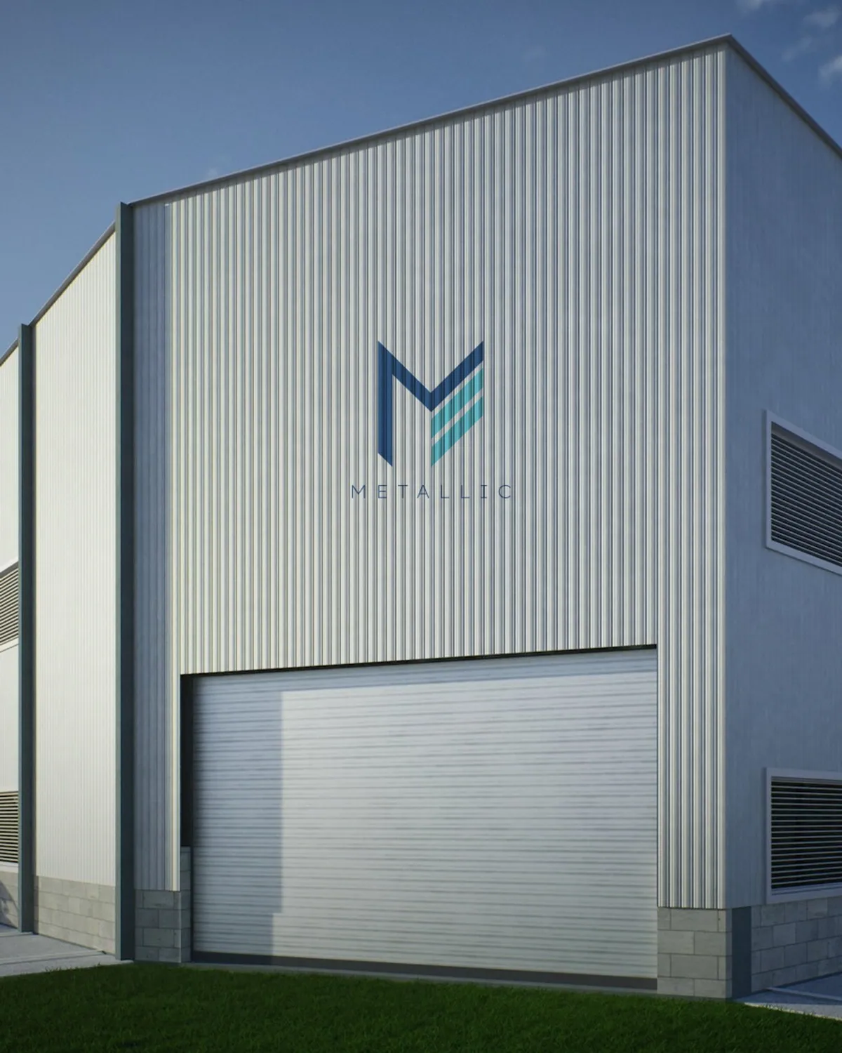
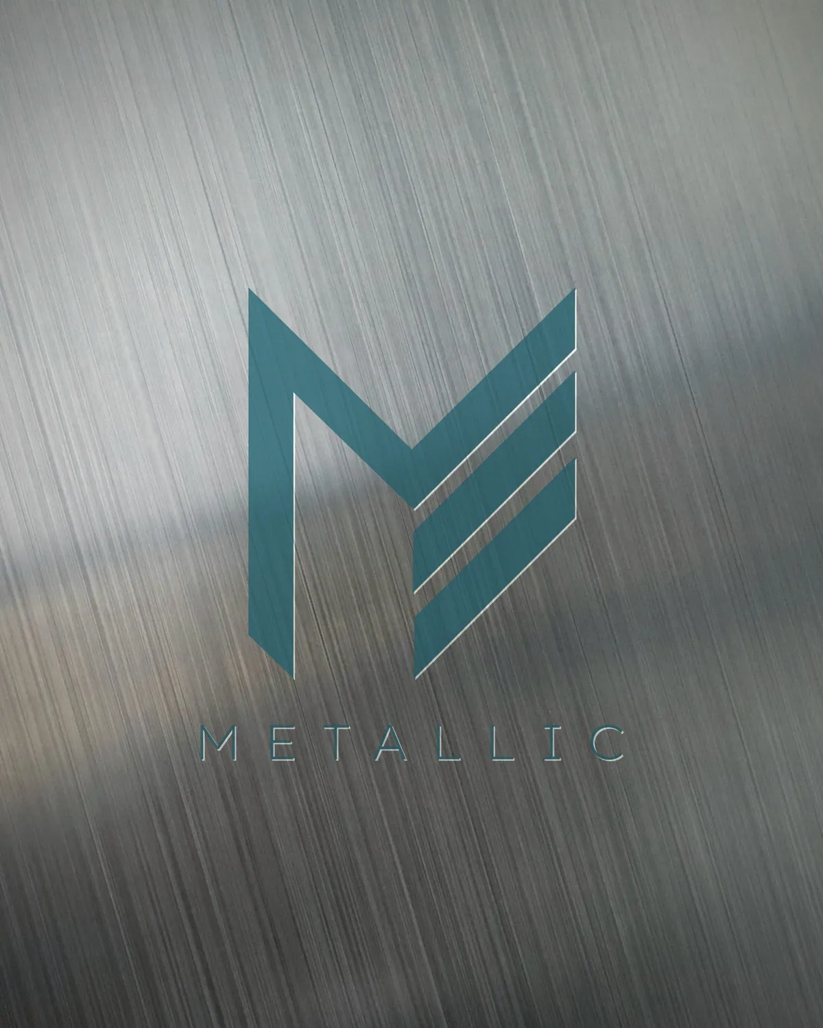
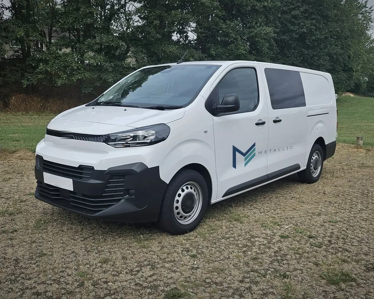
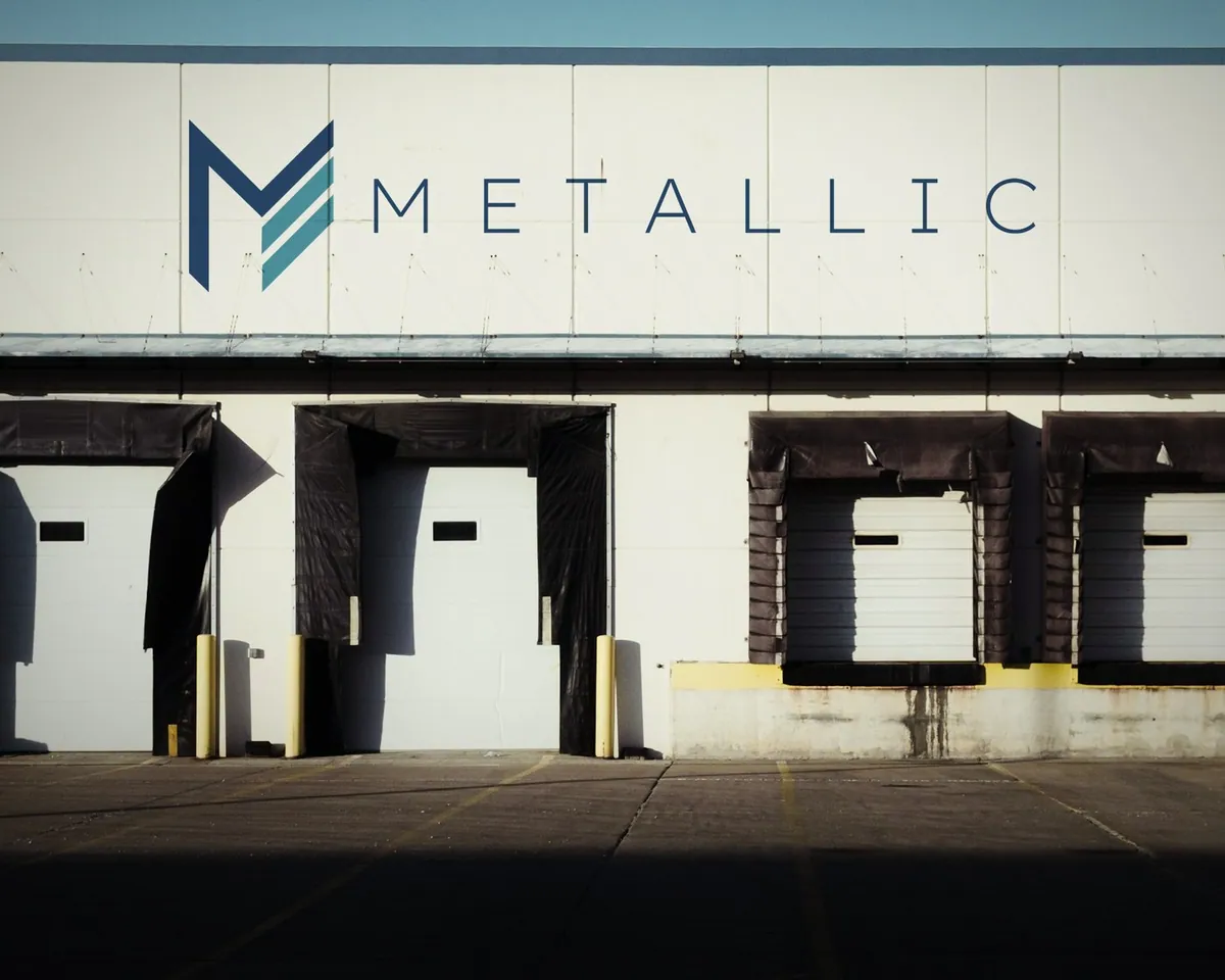
An industrial brand. A steel-navy M with teal bars cut through it like stacked sheet metal, over a light, widely spaced name.
- Steel navy #2C5074
- Teal #4CA4AC
- White #FFFFFF
Mona Sans Light, matched to the wordmark
- 07 / 11Barbershop
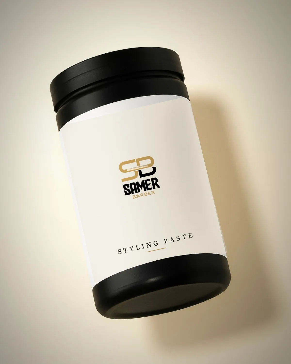
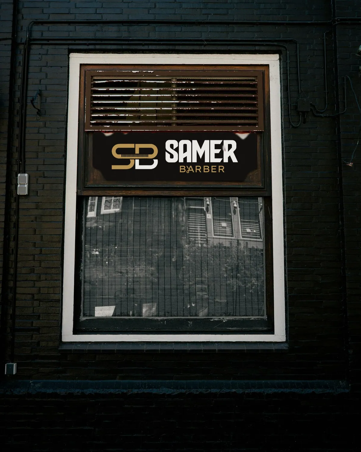
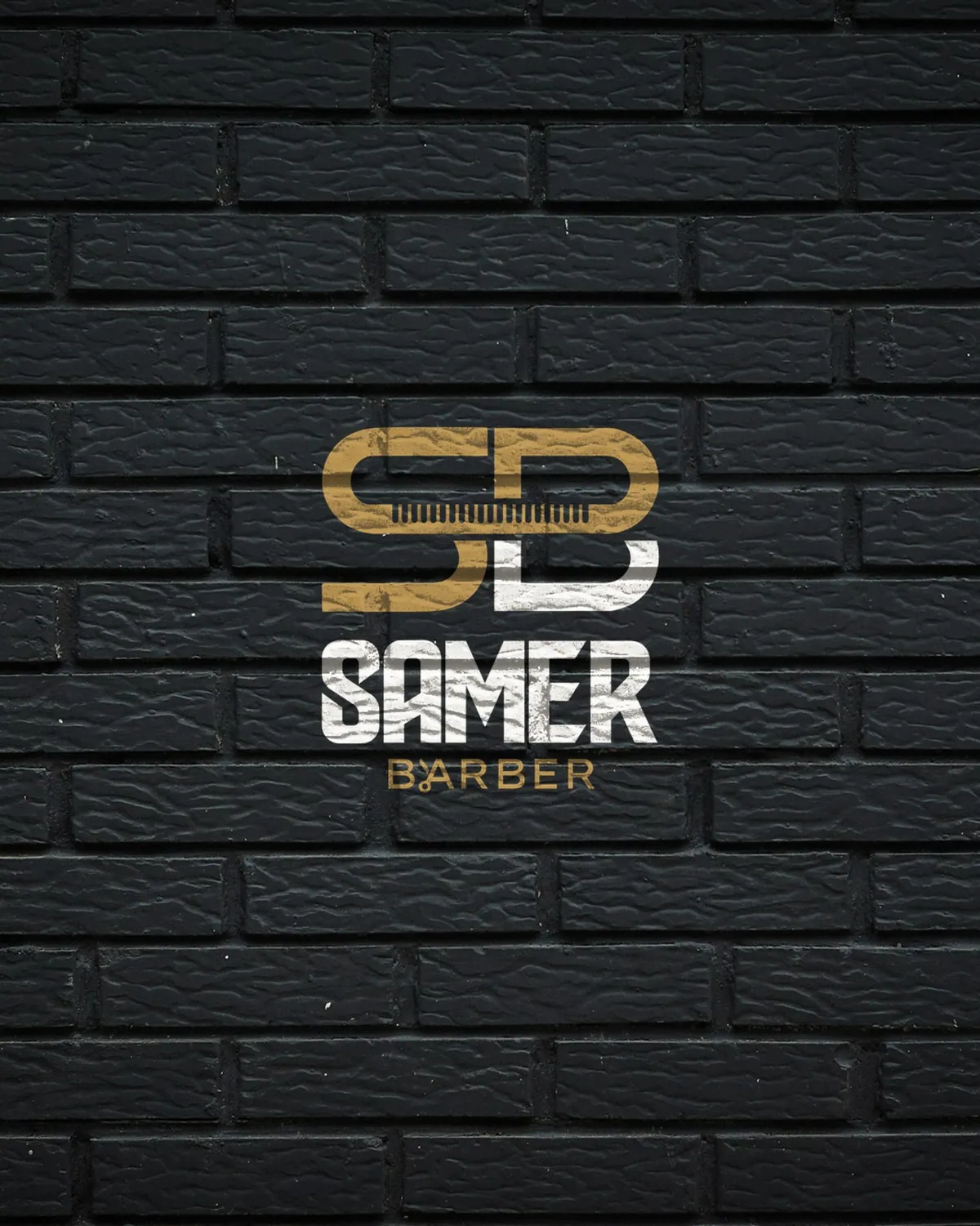
A barbershop. The S and B lock together around a comb, in gold and white, above a heavy name made to read from across the street.
- Gold #D3A85B
- Black #111111
- Chalk #F4F1EA
Unbounded, matched to the wordmark
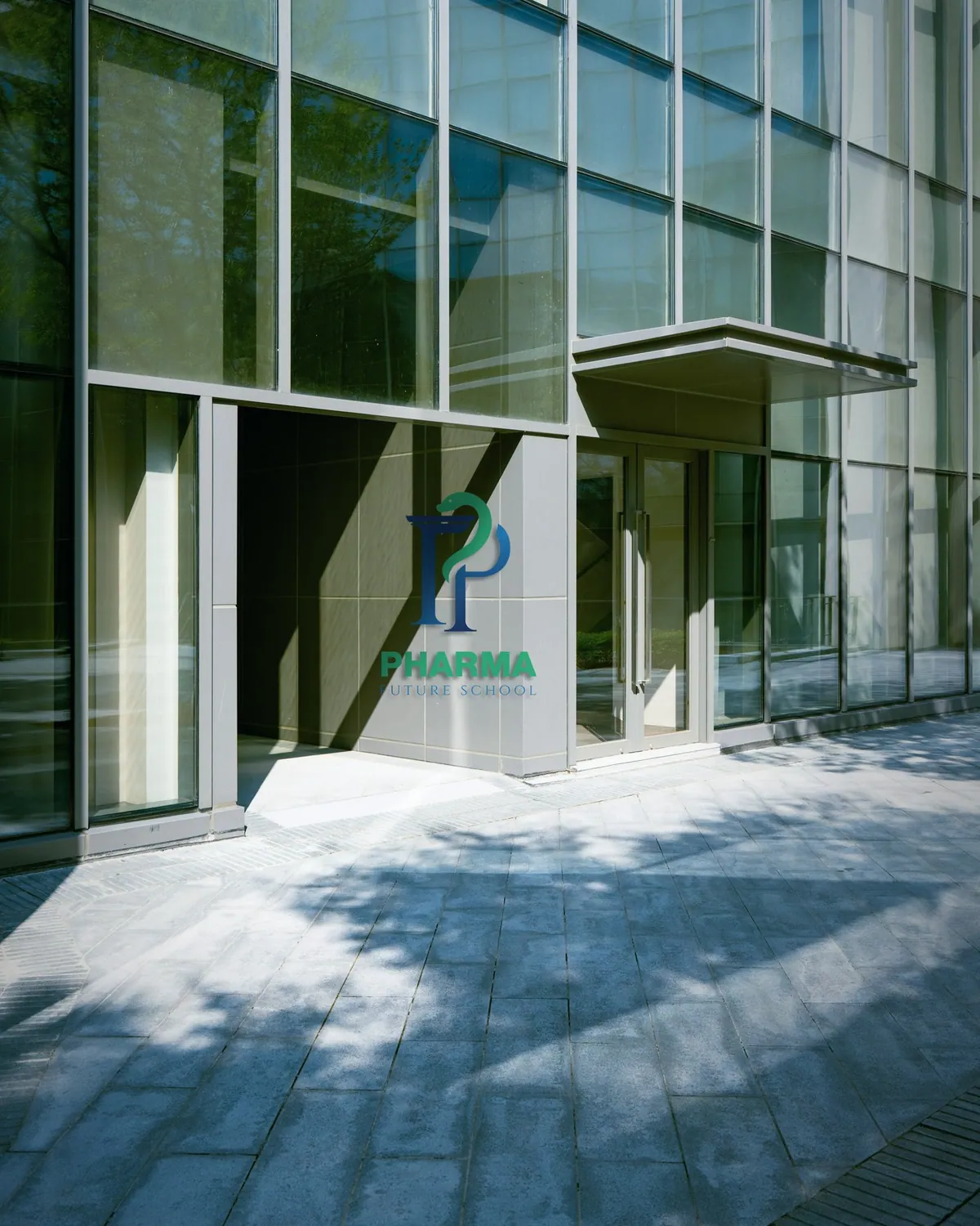
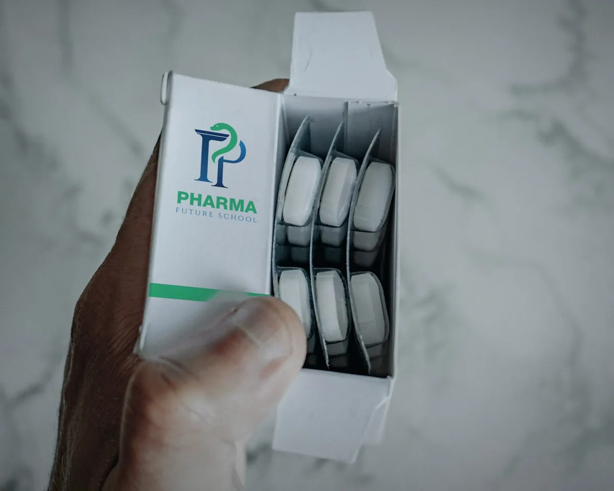
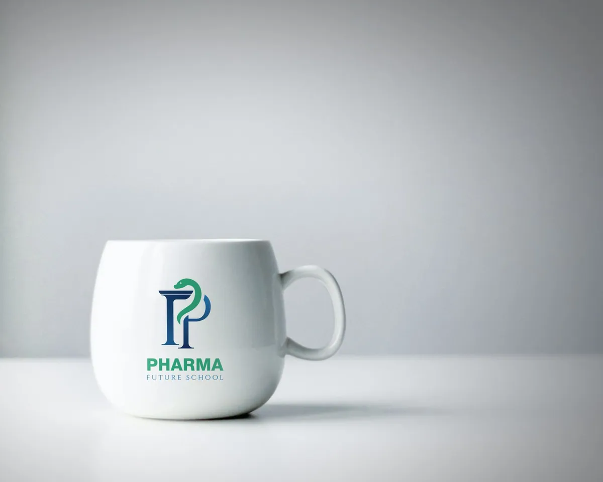
- 08 / 11Education
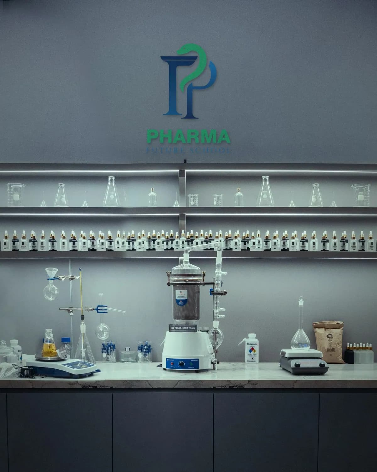
A school in pharmacy. The P stands as a column, and a green serpent winds around it, borrowing the oldest symbol in pharmacy.
- Royal blue #1F5E99
- Mint green #2BB873
- Deep navy #0E2A47
Archivo Heavy, matched to the wordmark
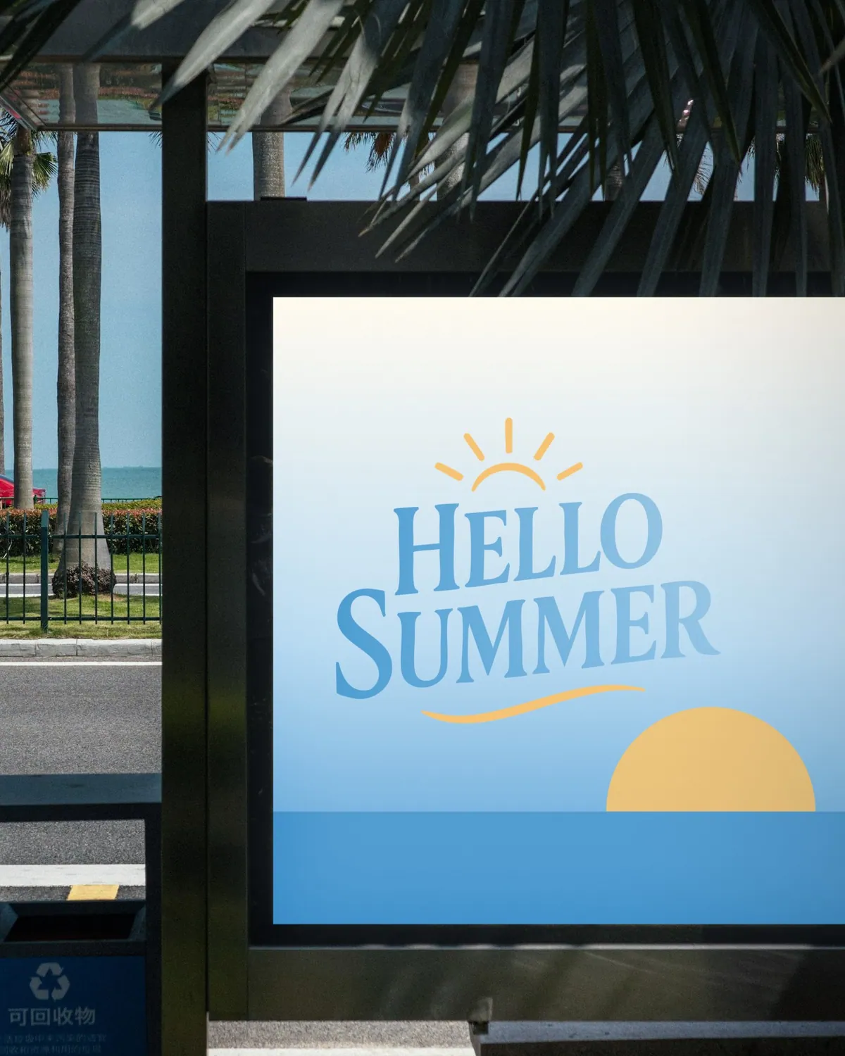
- 09 / 11Seasonal
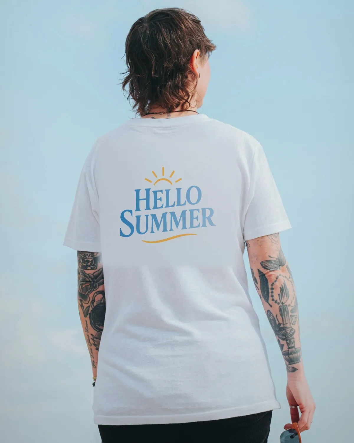
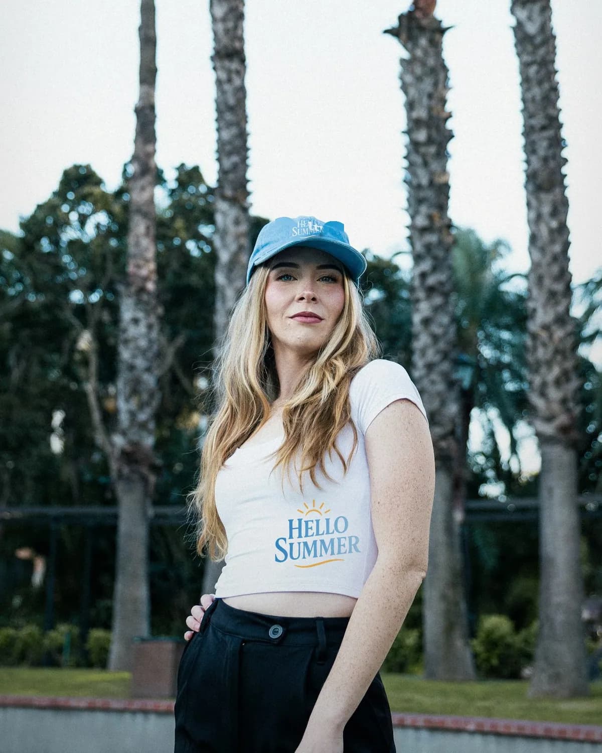
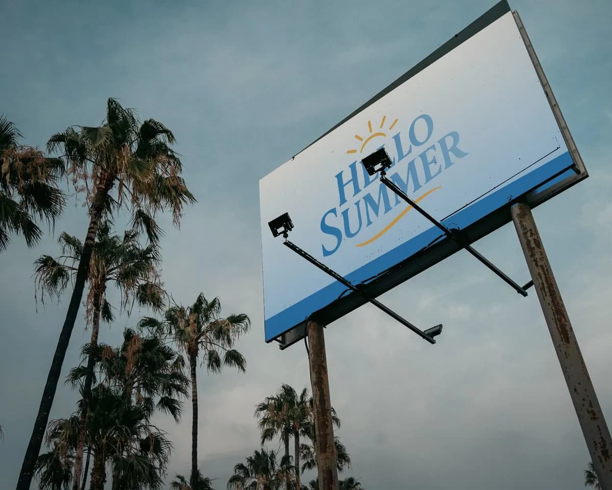
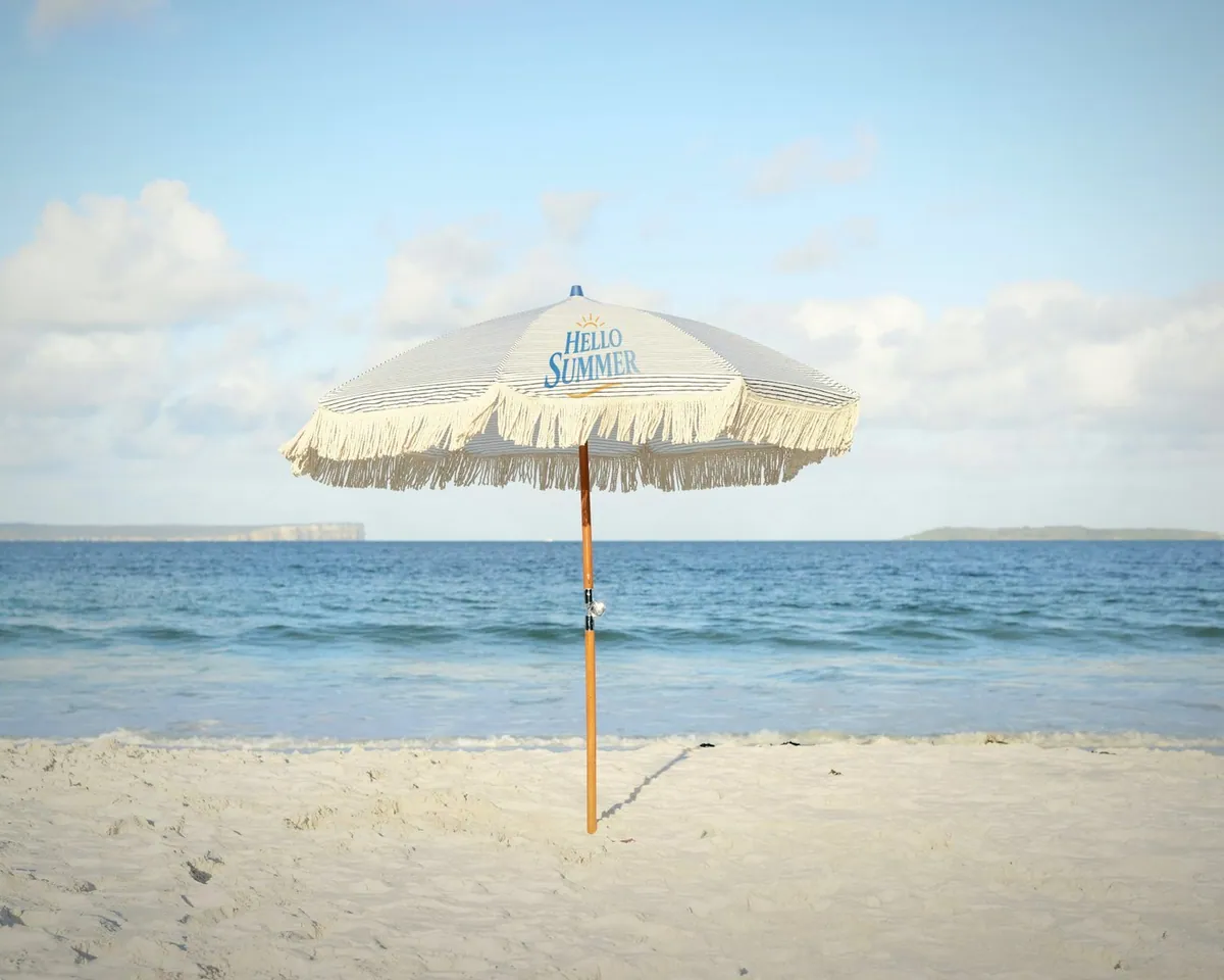
A summer mark. A sun rises over hand-cut, flared letters that fade from sea blue to pale sky, with a warm stroke underneath like a horizon.
- Sea blue #2F86C6
- Pale sky #A9CFEA
- Sun #F8B23C
Fraunces, matched to the lettering
- 10 / 11Food
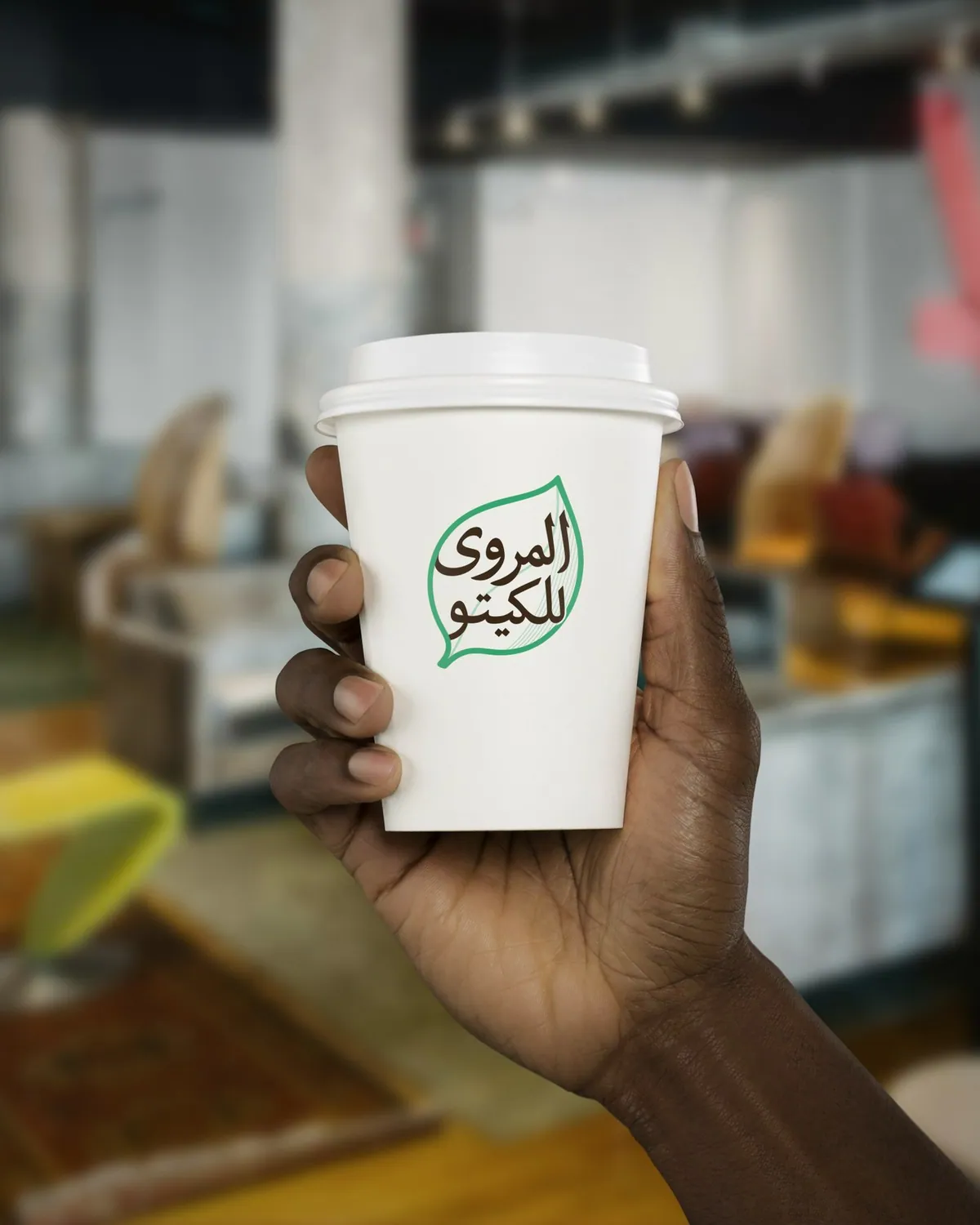
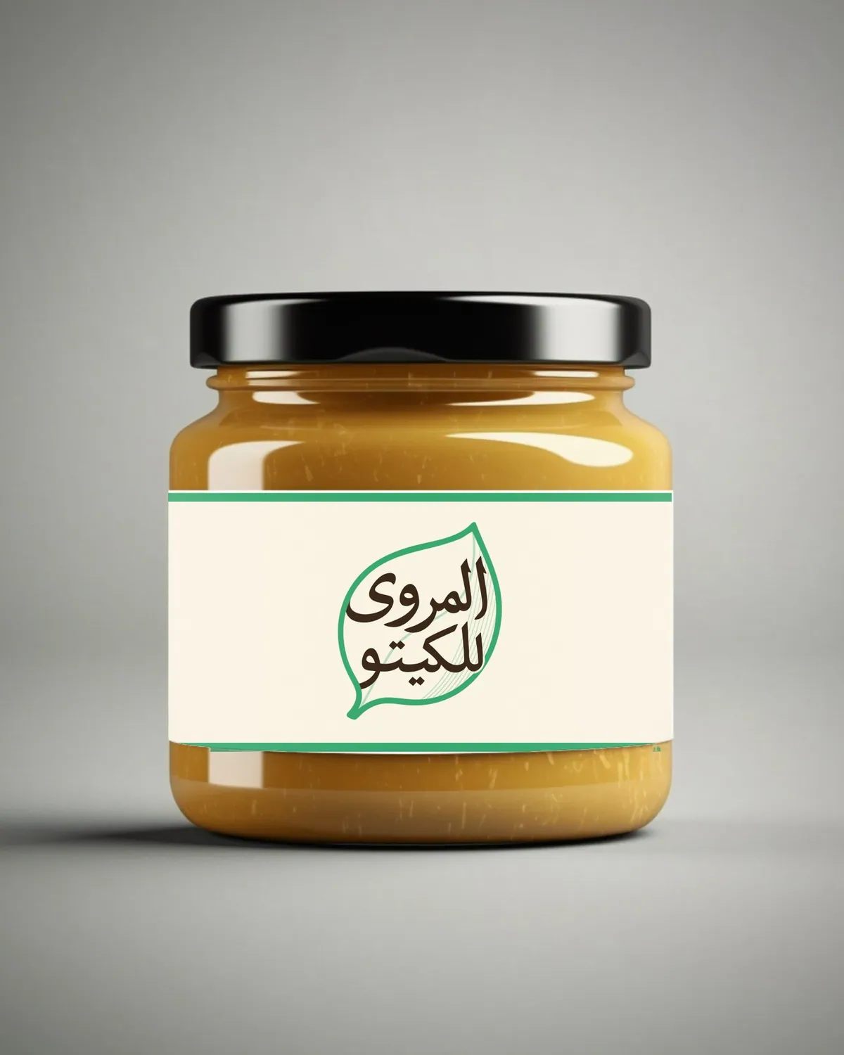
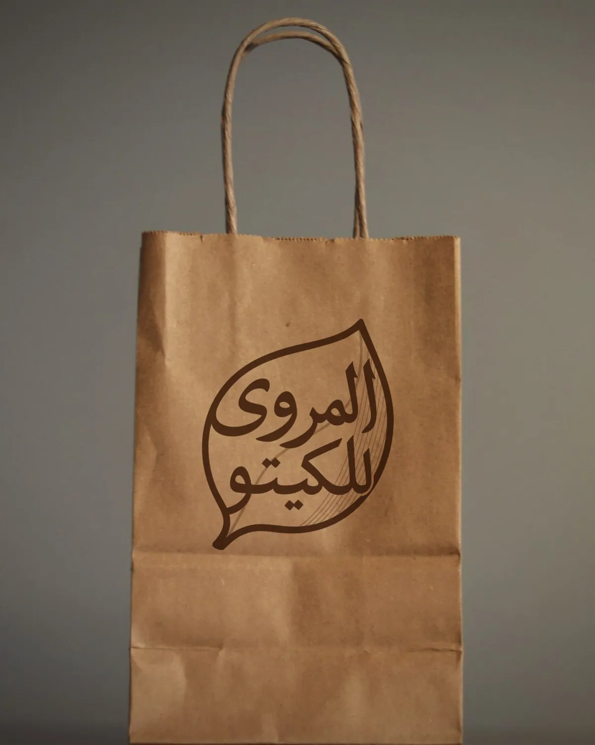
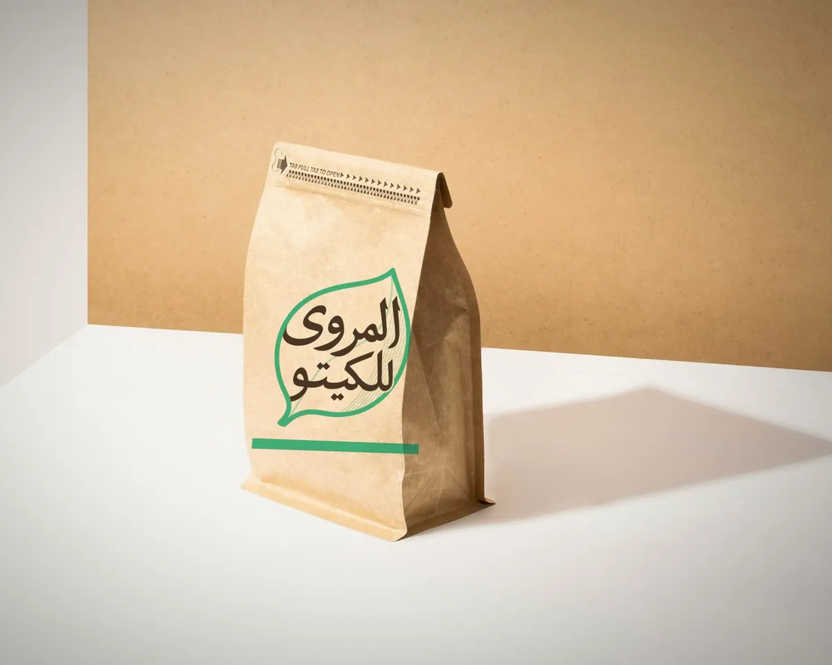
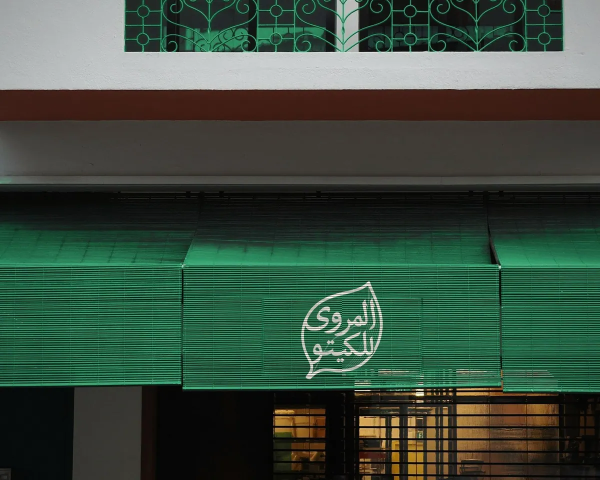
A keto food brand. The Arabic name sits inside a single leaf, in cocoa brown and fresh green, simple enough to read at a glance on a sign or a mug.
- Leaf green #2DAE74
- Cocoa #3A2817
- Cream #F4EEDF
El Messiri, matched to the Arabic lettering
- 11 / 11Lifestyle
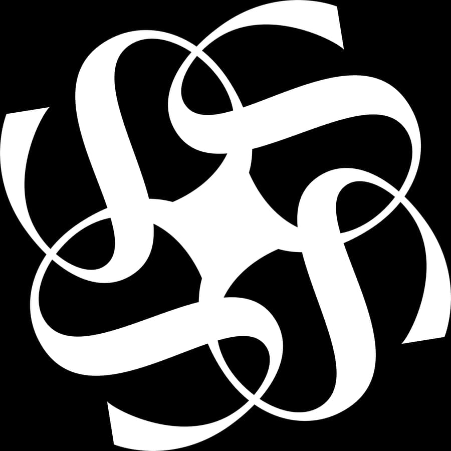
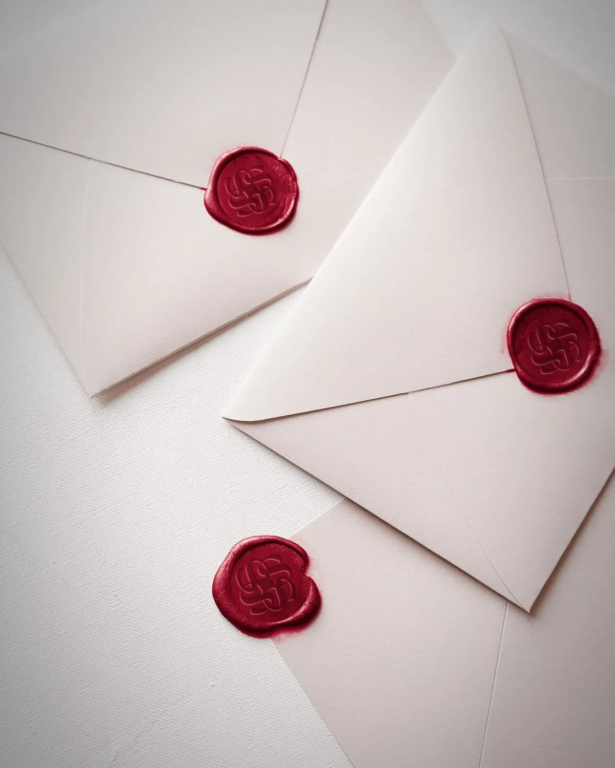
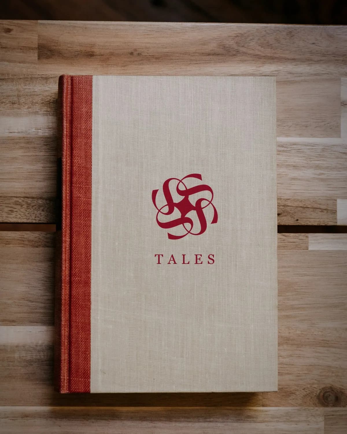
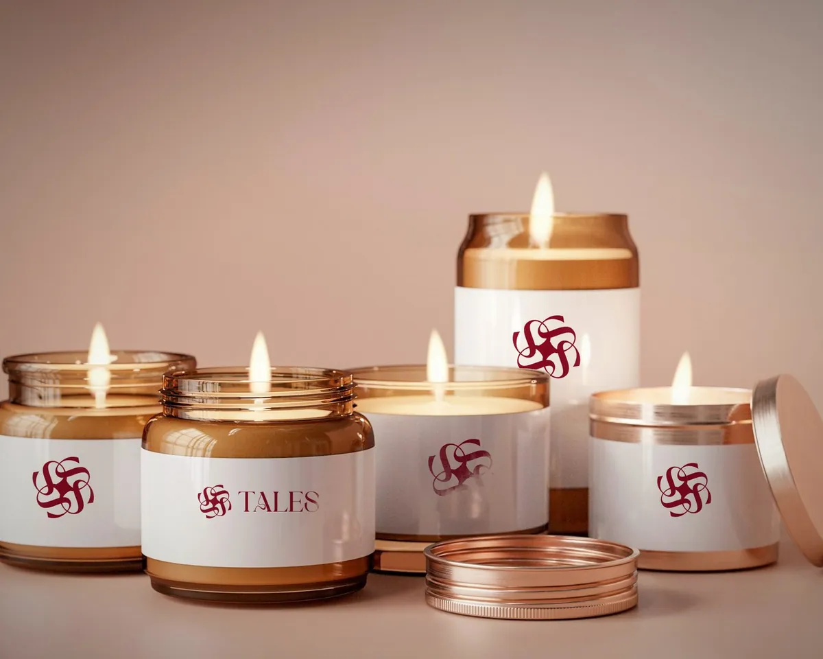
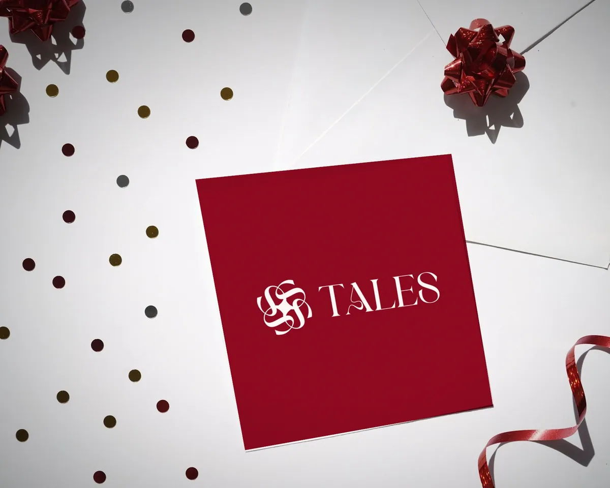
Four ribbon letterforms interlace and turn around a centre like a rosette, set beside a high-contrast serif name, in deep crimson with blush and sand.
- Crimson #970A22
- Blush #F4BEB6
- Sand #E3D1C3
Playfair Display, matched to the wordmark



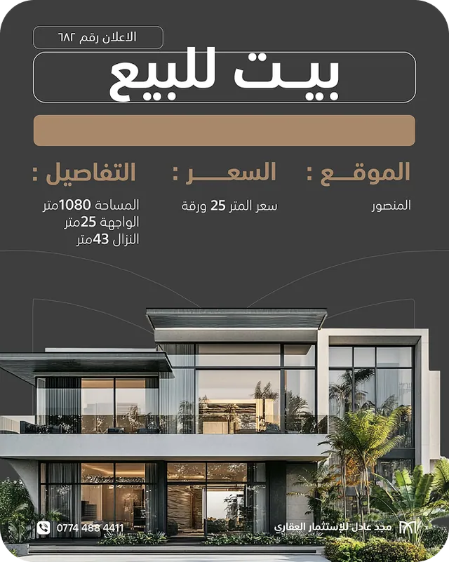
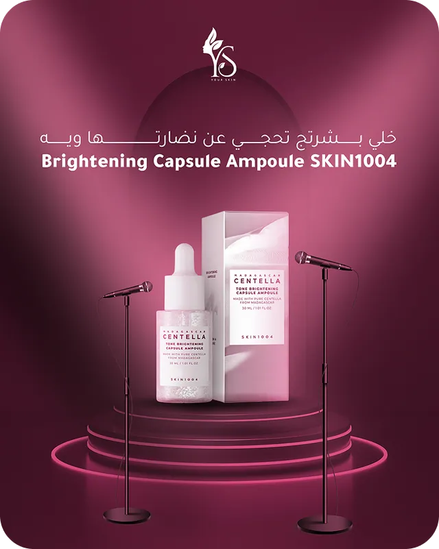
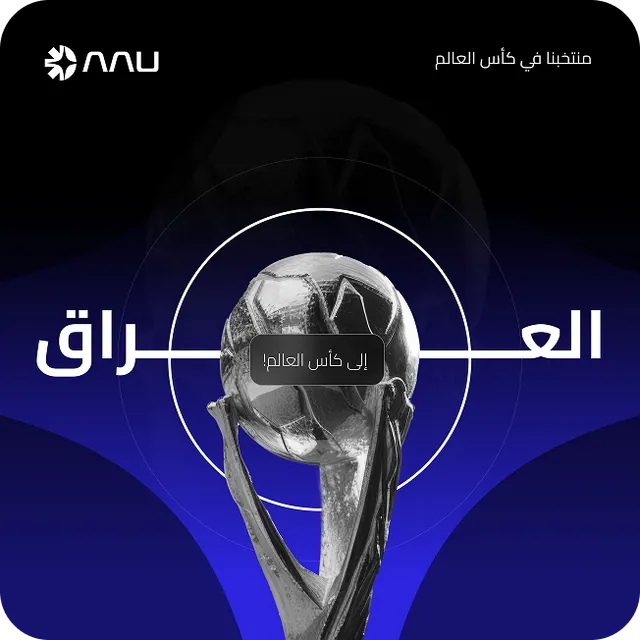
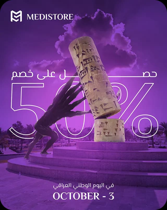
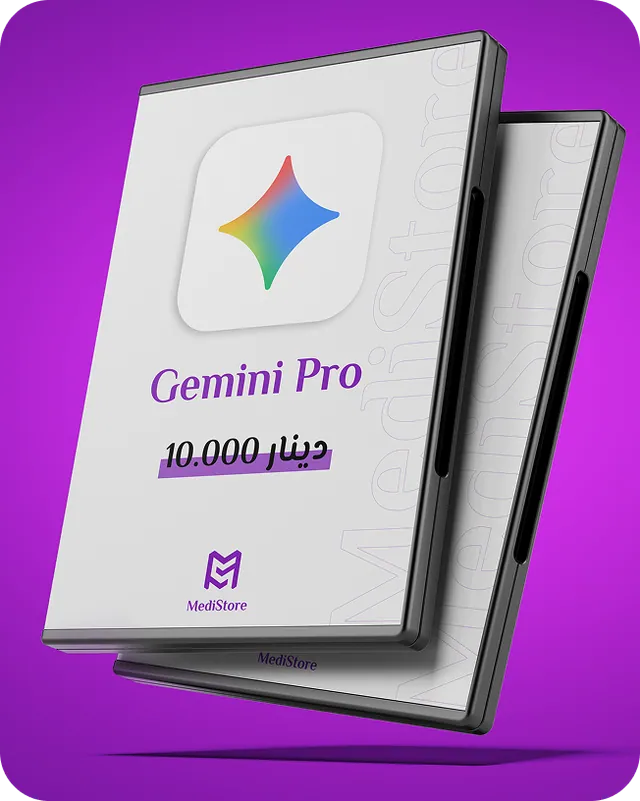
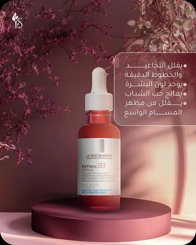
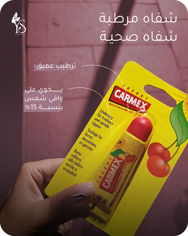
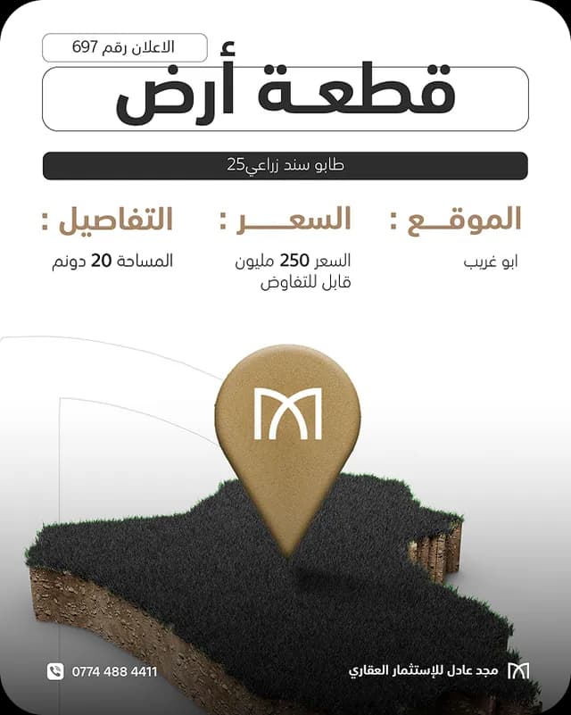
Alongside identity work: campaign and social design for brands in retail, health, real estate and technology.